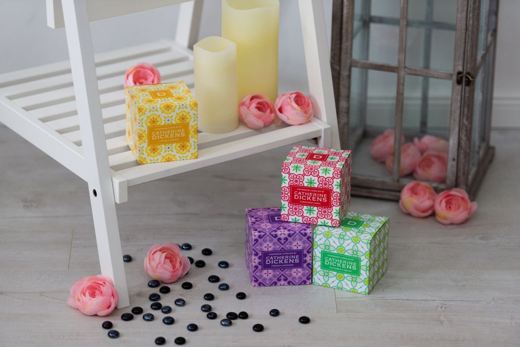
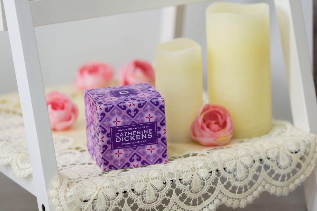
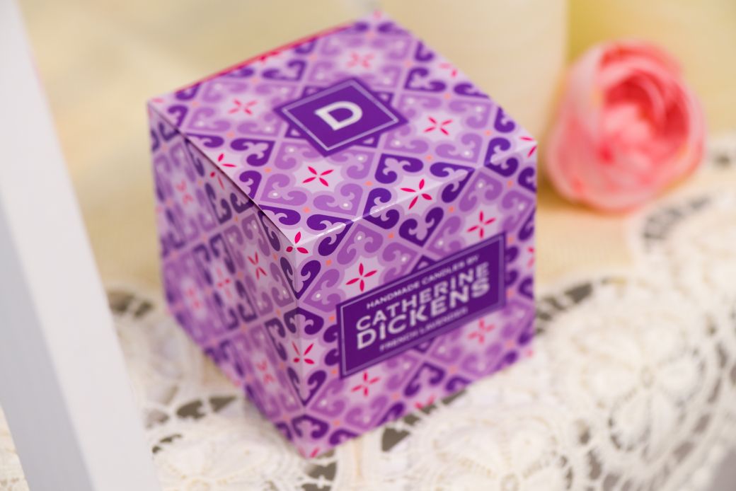
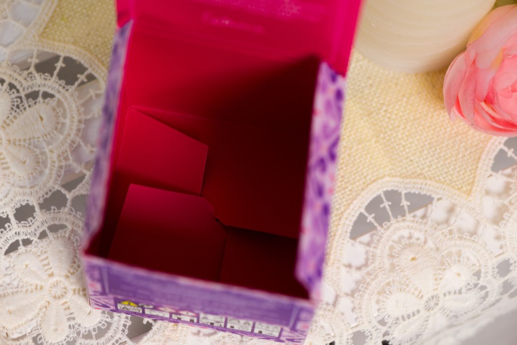
Catherine Dickens
The extraordinary challenge with the box designed for Catherine Dickens’ scented candles was not the form, as it was set to be a genuine cube with tuck-in flaps for closure both on the top and bottom. The real professional test with this product was the selection of the base material and the quality of printing.
The designer used very exciting, impulsive colours – both on the outside and internal surfaces of the box. The paper to be used as the base material had to be selected in view of the demand to print on both sides. On the outward-looking faces, the contours of the patterns are enhanced with UV varnishing. Perfect harmony was to be found between the colour of the candles placed in the box and the colour tones of printing on the outside and inside – which was obviously realised.